Showing posts with label Design. Show all posts

2023/08/16

Exploring Software Architecture: Microarchitecture vs. Standard Architecture

Software architecture serves as the foundation for any software application, determining its structure, scalability, and maintainability. Two prominent approaches to software architecture are microarchitecture (also known as microservices architecture) and standard architecture (monolithic architecture). 

In this article, we'll explore the intricacies of each approach and highlight their key differences.

Microarchitecture:

Microarchitecture, often referred to as microservices architecture, is a design approach that emphasizes breaking down an application into smaller, loosely coupled services. Each service handles a specific functionality and communicates with other services via well-defined APIs.

Microarchitecture Illustration
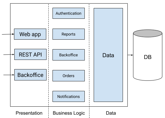

Advantages of Microarchitecture:

  • Scalability: Microarchitecture allows services to scale independently, accommodating varying levels of demand for different parts of the application.
  • Flexibility: Each service can use different technologies and programming languages, enabling the use of the best tool for each task.
  • Modularity: Services can be developed, tested, and deployed independently, facilitating continuous delivery and updates.

Challenges of Microarchitecture:

  • Complexity: Managing multiple services can lead to increased complexity, requiring robust monitoring and management tools.
  • Network Communication: Services communicate over a network, which may introduce latency compared to in-process communication.

Standard Architecture (Monolithic):

Standard architecture, often referred to as monolithic architecture, involves building an application as a single, self-contained unit. All components of the application are tightly integrated and run within the same process.


Standard Architecture Illustration
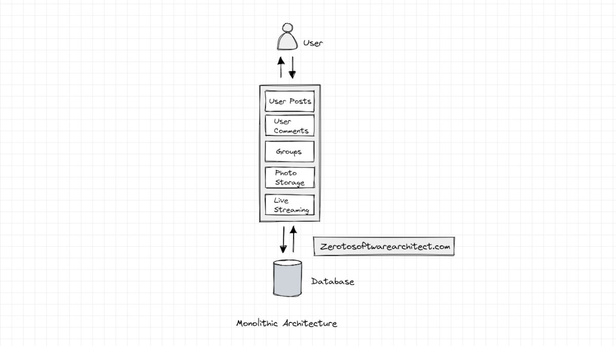


Image: An illustration of monolithic architecture. Source: Monolithic Architecture Simplified - Scaleyourapp

Advantages of Standard Architecture:

  • Simplicity: Monolithic applications are often simpler to develop, test, and deploy due to their cohesive nature.
  • Single Deployment: Since the entire application is deployed together, managing deployment is relatively straightforward.

Challenges of Standard Architecture:

  • Scalability: Scaling a monolithic application usually involves scaling the entire application, even if only a specific component requires more resources.
  • Technology Lock-in: All components of the application must use the same technology stack, limiting flexibility.

Choosing the Right Approach

The choice between microarchitecture and standard architecture depends on the project's requirements and goals. Microarchitecture is suitable for complex projects that demand scalability, flexibility, and independent deployment. On the other hand, standard architecture is preferable for smaller projects with simplicity and easier deployment as priorities.

To conclude whether you opt for microarchitecture or standard architecture, understanding the differences between the two will help you make informed decisions about designing and building your software application. Consider the project's scale, complexity, and long-term goals to select the architecture that aligns best with your needs.


2014/12/27

How To Stick To Your New Years Resolution - Anak IT Style


There are plenty of ways to stick your new years resolution. Whether it be to lose weight, take up a new good habit or get rid of an old bad habit, it takes commitment. Like A LOT! What if there is a way to get what you need to develop that habit all the way?

Beeminder - Be Mindful of your Goals

By making a pledge (for free) on Beeminder, it will help check on you if you are on track or not. If you stray too far, you lost your pledge. If you actually put a pledge (and this time, I mean actually pay for it like $10), that means you are invested in yourself to make sure that you achieve your goal. If you don't achieve it, you lose your $10. Check out the video below.


Now how do you make sure you achieve that new years resolution or that goal or that new good habit or getting rid of an old bad habit? Here are several web apps for you:

HabitRPG - Build a Habit While Playing RPG

Wanna play a game? No seriously, if you wanna build a habit, play at it with this nifty web app and game in RPG! And not only that, you can have more fun if you do it with a friend or more. Basically forming a party of other likeminded individuals who checks on each other to make sure that the goal is achieved.


Github - Social Coding While Networking

For those coders and programmers (and maybe designers) out there, you may have heard about Github. Well, if you wanna practice your coding skills or get better at what you do or even finish that IT project you promised your lecturer at your Uni, Github is the place to publish and get your work on track. Beeminder + Github is a powerful duo to keep track on whether you are actually progressing with your coding and designing of your project all the way to finishing an actual IT product. Get your hands on those keyboard and start coding away! Can't do it alone? Get a team and do it together with HabitRPG.

Duolingo - Learn a New Language in a Game

Ever wanted to learn Spanish but never got around to it? Learn it over on Duolingo. The app has a very intuitive interface and learning style to get you to understand and enjoy the language as you learn new words to use. I have learnt a few words and it was fun! Not only that, linking it with Beeminder will help keep in track of how far have I progress and how close I am to reaching my goal at the end. Duolingo has the following languages available:

  • Spanish
  • French
  • German
  • Italian
  • Dutch
  • Portuguese
  • Irish
  • Danish and
  • Swedish
Unfortunately, no Brunei Malay, Malaysian Malay, Indonesian Malay, and all of that Malay language and dialects. Check out the video below.


Remember, you don't have to do your new years resolution. Do it with a friend or your sibling or family. Get together, exercise, code, design, build a new good habit, get rid of a bad one. It's a lot more fun that way.

So, what's your new years resolution?


2010/05/27

The Lasso Tool

Assalamualaikum,
After a while of not posting on anak.it I've decided to go with a very basic tutorial that a friend of mine has requested recently, which is how to lasso an object, person and so on.  One thing I know about lasso-ing to complete "perfection" is that you need patience and a good eye.
To start off, I've picked this picture of fellow member Fadhullah as an example.

Second step, on the left side you will see a column of tools, look for the Lasso Tool icon as circled above, right click on the icon and left click on "magnetic lasso tool".
Third step, left click on the image where you want to start and just circle around that object/person, make sure to have both ends meet or just double click to join the ends. The selected area will be represented by "marching ants". You can try to make it as perfect as you can, but if it doesn't turn out the way you want it to, don't panic, I'll tell you how to fix it.
Fourth step, like the image above, if you have accidentally lasso-ed a part of the image that you don't want to lasso simply hold down the alt key and left click on your mouse, release the alt key and move your mouse to "throw away" the unwanted parts. Make sure to have both ends meet or double click.
Fifth step, just like the fourth step, you can do the same alt + left click to take away the image in between, say, the arms to create a gap.
Sixth step, in cases where you want to select the part of the image that you accidentally left out, you can just hold the shift key + left click and go over the area that you missed. This is especially essential when it comes to parts of hair that sticks out.
To lasso the "exact" part of the image that you want, make sure to zoom into or out of the image by pressing ctrl together with the + or - signs so it can be as precise as you want it to be. Be prepared for sore eyes.
This is basically the end result of the lasso-ing of Fadhullah's image that I've done. If you want to select the reverse of what you have lasso-ed just press ctrl + shift + i, you can add effects to the background or just simply delete it by pressing the delete button. That's pretty much all I have for now on the Lasso Tool. Hope this was helpful.
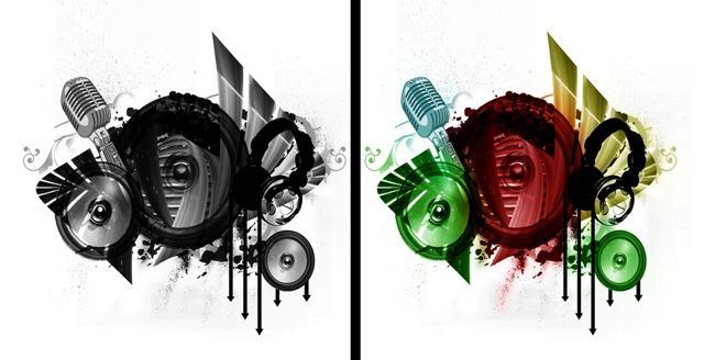
For this post, I will show you an easy way to colourise a black and white brush like the image below

First thing you’ve got to do is pick a brush of choice, for my example I’ve chosen this brush from here. When you’ve thought of what brush you want to use you should always create a new layer before you start pasting the brush so you can just easily delete it if you ever change your mind. To do so, you should click the new layer icon in the lower part of the layer’s section like so,
Layer 1 will pop up in the layer column and you can then paste the brush there. After pasting the brush of choice you can now begin selecting colours. Again, this is essential for you to
1. create a new layer, you can name this layer by the name of the colour, like such
2. Make sure you change your brush to basic brush through the icon circled and numbered (2.)
3. Colour over the part of the image that you want to be colour like in (3.) then change the blending mode from Normal to Soft light or overlay, but in my opinion it’s better to just use soft light. (This can be found in the Layers’ column next to opacity in case you didn’t know).
You can then repeat this process of colouring to the other parts of the image with different colours. Take note that you should ALWAYS create a new layer because if you use the same layer with different colours you might end up with deleting the whole colouring when you just want to remove a single colour in the end. But then ctrl+alt+Z can be used too but that would be of limited use as the history won’t fully be there. This is basically what I’ve done to the brush
And this is the result when I apply the soft light blending mode to the colours,

Notice that the headphone isn’t coloured, that’s because super black images can’t be coloured. You can try though, but I won’t really pop-out as much as the rest of the image. Anyway, I hope this tutorial was helpful. Again, for more inquiries, please go to the “Miana Kan Tue?” section above.
Experiment, experiment, experiment.

2010/04/13

Easy steps: HDR effects via Adobe Photoshop Lightroom 3 beta 2


Easy steps to applying the HDR effects via Adobe Photoshop Lightroom 3 beta 2
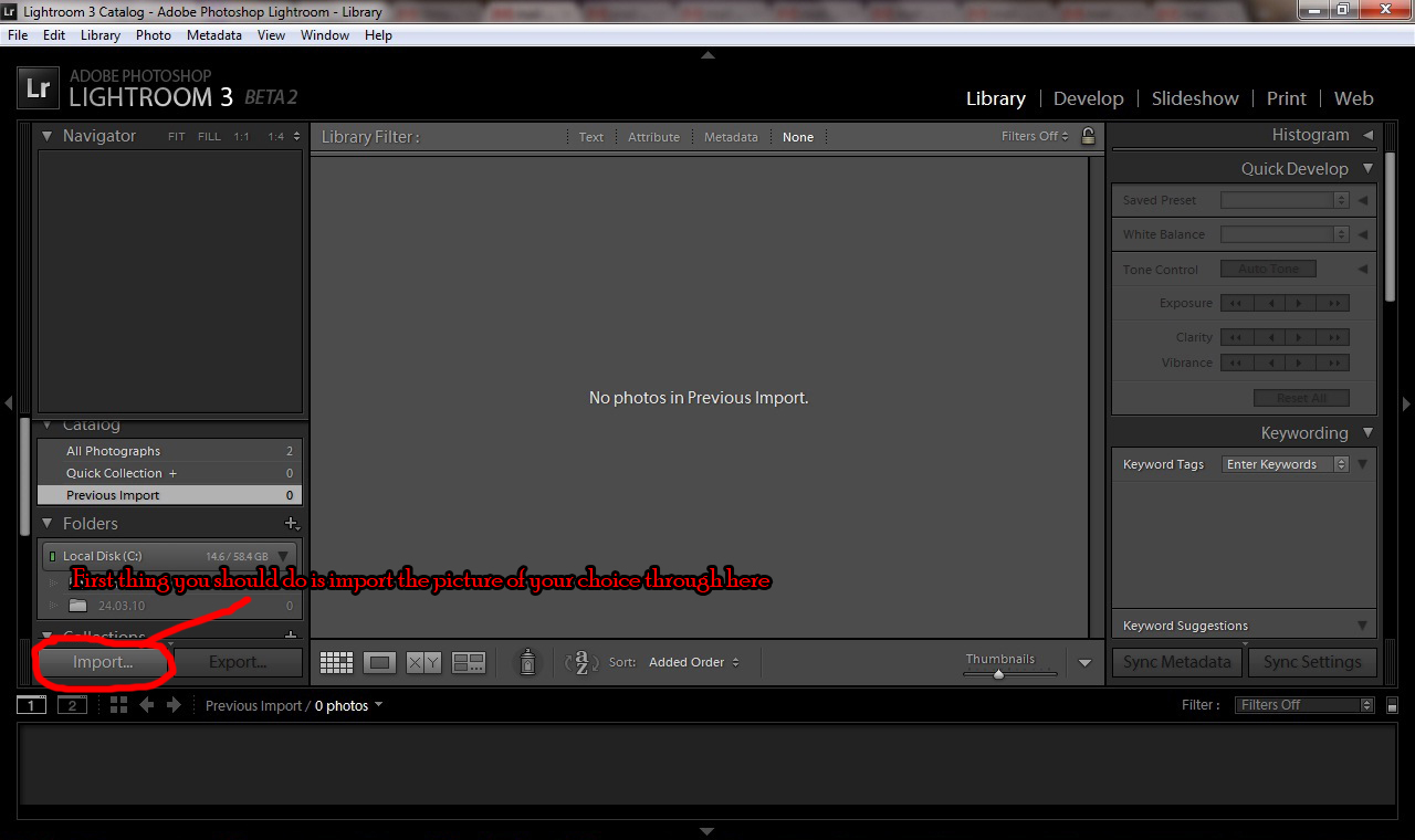
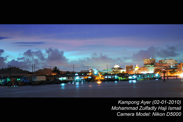
First of all, the term "HDR" means High Dynamic Range imaging. Most of you would probably be wondering how to apply the HDR effect to an image, like the photo below this text. I shall give you easy steps to applying this effect using Adobe Photoshop Lightroom 3 beta 2, but you can also use versions of Lightroom older than version 3 beta 2.
I've decided to give you "print-screen" tutorial pictures so it's easier to see what I'm talking about.
So, I hope you understood what I was trying to explain. For more inquiries, dipersilakan menakan "Miana Kan Tue?" on the top of this page. =)
Never be afraid of experimenting.

2010/02/01

How a picture may affect your design


Salam Anak IT.
"How a picture may affect your design" or actually I could say it "How IMAGINARY picture may affect your design".
If you want to design something, first you must have good imagination how the design would be. But for those yang inda dapat imagine atue miana?
Here I would like to share a basic concept on designing.
  • WHAT is it all about?
  • WHY do you need to design it?
  • WHERE do you want to put the design?
  • WHEN the design takes place?
  • And the most important part is, WHO is your target audience?
If you have compiled everything, you may have certain points which you would like to include in your design.
As example, when I created ANAK I.T's logo, I was thinking on certain points...
  • WHAT is it all about?
    • Aaaaa... It is... mmmm... paaasaaaall.... IT? haha ok any computer related...
  • WHY do I need it?
    • To author the http://anak.it la... every product NEEDS a logo kalie ah... It shows the people the product itself... Mustahil jua keta liksus or even misidis inda ada logo masing-masing...
  • WHERE I will place the logo?
    • Mainly arah http://anak.it which the site's objective is to give anak Brunei kitani basic knowledge on certain computer-related issues...
  • WHO is my target audience?
    • The readers which I BELIEVE, most of them will be computer-literated or the best way to put it "pandai menaip arah MS Word or OpenOffice" or even worse "buka pisbuk tiap ari"
So... Hmmm... It is about computer-related?... Hmmm... Let me see... *liat sekeliling apa yang kena mengena sal IT/Computer*
GOTCHA! I've locked my eyes on something... My DELL LCD Monitor's on/off switch button's symbol... I took a picture of it...
Alright... I got the first point... On/Off Switch button... Every people knows that it is usually used by computer hardware to switch it ON and OFF... *now even mobile phones use the same symbol*... Then... Apa lagi?... *subuk dalam computer* ahahaha I've got my second point... Every machine uses motherboard nowadays... Then... Hmmm... *selak buku komputer pasal Computer System* Alright... ZEROs and ONEs... "Computer only understand 0 and 1" or I called it On and Off... That is the only way how human can interact with computer... It is called "machine language" or in general people named it as "Binary"...
Tapinya kan... Usually every organisation ada motto bisdia sendiri... Should I put it?... "The site's objective is to give anak Brunei kitani basic knowledge on certain computer-related issues" so it is basically a learning place kah?... Since it is mainly for anak Brunei kitani, why not I use Perambahan Brunei as the motto which is related to learning?... Oh! I got it...
When I compile everything, I have these points with me to be included in the logo designing development:
  • ON/OFF Switch symbol
  • Motherboard and of course the colour of green
  • Binary
  • Perambahan Brunei as motto
After the development process, here is what I've got,
ANAK I.T's logo
If you remember in my previous post regarding design, the design should not include "I, Me, We, Us, My BF/GF". The logo was created based on the points listed before and bukannya "aku mau cani... yang ani bisai..." . During the development, I've asked certain IT-related people which is also my target audience regarding the logo design and based on their opinions, I've changed certain elements and finished up the logo development process.
Here are some example of my products with given points:
Acara: Pertandingan Akhir Drama Bahasa Melayu...
Tempat: Dewan Bahasa dan Pustaka
The word "DRAMA" makes me imagine a stage or apa nya kitani as pentas. When I further my imagination, I picture a stage of Sekolah Menengah Berakas (back when I was in secondary school) which has red curtain as tutup/buka pentas masa persembahan drama. So, here is what I've done. Around 10 minutes punya kraja including planning/analysis and development processes.
Next,
Acara: Persembahan Malam Juara-Juara Pertandingan Kesenian dan Kebudayaan
Jam: 7:30 Malam
Bertempat: Ruang Legar The Mall Gadong
The points are:
  • Pasal Kesenian dan Kebudayaan
    • Corak Aing Mulih (Kesenian Brunei), warna Hijau (Kebudayaan Islam Brunei), warna Keemasan (Warna Seni Pertukangan Brunei)
  • Acara berlangsung waktu MALAM
    • Dark design
  • Arah Mall Gadong
    • Gambar to be filled at the back of the programme book. The PICTURE shows that the event is held at The Mall Gadong.
Im sorry that maybe arah sini the text for the title may hardly readable since I compressed and resized the image to be viewed on this site but the original is in A4 size paper (Borderless) lipat dua.
Another one,
Acara: Walkaton Hari Guru
Lokasi: Pantai Seri Kenangan
The points will be:
  • Acara Walkathon
    • Tapak kasut
  • Berlangsung di pantai
    • Pasir
Jika dicantumkan menjadi "Tapak Kasut di atas pasir",
Sekian. Wabillahitaufiq walhidayah.

2010/01/22

Is there such a thing as "Good Design"?

Salam Anak IT.
Good design... Who can tell me what is a good design?... Nice colour?... "Nyaman mata meliat"?... Well the right answer is "UP TO YOU"...
The simplest example would be, just look at this page's layout and design... The one who designed the layout will say that it is "techy" based on his analysis with other users before the layout has been implemented... But some of your eyes might be different... There is a possibility that some of us might say "I prefer it to be PINKY" or even "lawa lagi kanak-kanak kindergarden punya lukisan" and so on... But do you think majority of people will think the same way as you think?... Again... It's a NO... That is when at least you need to understand certain points.
In designing, there will be no word as "I, Me, We, Us, My BF/GF" but it is all about "Him/Her, Them, They, You" (credits for Hj Idham ITB). What I mean is that we need to make sure who are our TARGET AUDIENCES. From there, we will start jotting down other points such as the purpose of the requested design, colour, theme, style, structure etc. THEN we will decide on what technologies required to complete the designing process.
Talking about colours, different people with different opinion on colours. As example, which one of the three colours below do you prefer?
Some people might choose 1st, some 2nd, some 3rd and probably MOST of us will say "my FAVOURITE COLOUR is not listed so I don't bother...". Remember, in designing there is no "I, Me, We, Us, My BF/GF". I've been facing with clients that choose colours based on their FAVOURITE ONE. I'd like to share something that might be useful for you and it has been my strongest attitude or I should say "PENDIRIAN". A word "professional" does not and will never embedded with "personal"; and so does "professional designing". I would like to elaborate and share more on the word "professional" based on my own opinion but hehe we are not in the right category.
So back to square one nya c boboi KristalFM, it is really tough for people to determine a really good design since we have different ways of thinking on certain things. InsyaAllah in the near future, I will elaborate more on designing techniques such as step by step procedures, sketching, interface, colour theory dan yang sewaktu dengannya. Sekian.
P/S: In most cases, pictures can be part of the design as well ;) I will give examples in the next post regarding Design.